
How to Reduce Bounce Rate on Shopify Product Pages
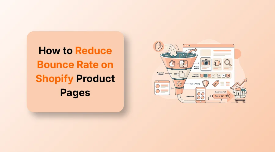
To reduce bounce rate on Shopify product pages, align the initial view with visitor intent, display product details and clear images fast, simplify variant choices, show pricing upfront, build trust, and remove mobile friction.
Shoppers want immediate answers when they land on your store. A sudden bounce means your page created friction instead of clarity. Learn how to reduce bounce rate on Shopify product pages by fixing key user experience problems.
Instead of guessing what went wrong or burning money on a full redesign, focus on real buying obstacles. Fix the actual user experience issues driving visitors away.
This guide covers actionable strategies to turn hesitant visitors into confident buyers. Read it thoroughly and implement these practical strategies.
What Does Bounce Rate Mean for a Shopify Product Page?
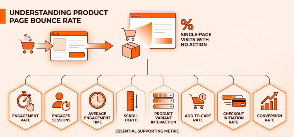
Bounce rate measures the percentage of single-page visits where a shopper leaves without taking action.
However, bounce rate alone can’t explain why visitors leave. Exit rate differs because it tracks users leaving after viewing multiple pages.
Analytics platforms also define these metrics differently. Google Analytics 4 tracks engaged sessions, while Shopify measures immediate bounces differently.
Never obsess over a universal target percentage. A high bounce rate is not automatically bad if traffic comes from cold ad sources. A low bounce rate is not automatically a win if visitors stay without adding products to the cart.
Bounce rate is merely a symptom, while visitor behavior reveals the actual cause. Check bounce rate alongside these essential supporting metrics:
- Engagement Rate: Measures active shopper interaction on the page.
- Engaged Sessions: Tracks visits that last over 10 seconds or include multi-page views.
- Average Engagement Time: Reveals how long users read before leaving.
- Scroll Depth: Shows how far shoppers scroll down your media and descriptions.
- Product Variant Interaction: Pinpoints option confusion among colors or sizes.
- Add-to-Cart Rate: Tracks direct purchase intent from the main section.
- Checkout Initiation Rate: Displays the move from cart to purchase.
- Conversion Rate: Serves as the ultimate indicator of page success.
Things You Need to Do Before You Fix Bounce Rate
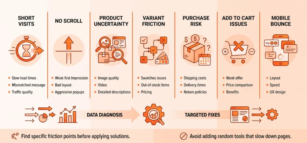
Find out where and why visitors leave before you change a single page element. Randomly adding reviews, badges, popups, or apps without data wastes effort.
Unnecessary apps also add heavy code that destroys page speed and causes even more bounces.
This simple diagnostic framework isolates the real issue:
| What Shoppers Do | Likely Problem | What to Check |
| Leave within a few seconds | Slow load time or message mismatch | Speed, traffic source, and immediate mobile popups |
| View the page but do not scroll | Weak first impression | Above-the-fold layout, main headline, and aggressive popups |
| View images but leave | Product uncertainty | Images, video, and detailed specifications |
| Interact with variants but leave | Variant selection friction | Swatches, out-of-stock items, variant-specific prices, and gallery images |
| Scroll to shipping or policies then leave | Purchase risk | Shipping cost sticker shock, delivery times, and return policies |
| Add no product to cart despite engagement | Weak value or offer | Price, benefits, bundles, and incentives |
| Mobile bounce is much higher | Mobile UX problem | Layout, speed, tap targets, and sticky CTA placement |
Merchants often add random tools to fix bounce rates. That approach creates page bloat, slows load times, and hides the real friction points.
First, target the exact point where shoppers abandon the page. Then, apply specific fixes to keep buyers moving forward.
12 Strategies to Reduce Bounce Rate on Shopify Product Pages
Follow these proven strategies to reduce bounce rate on your Shopify store.
1. Match the Product Page With the Visitor’s Original Intent
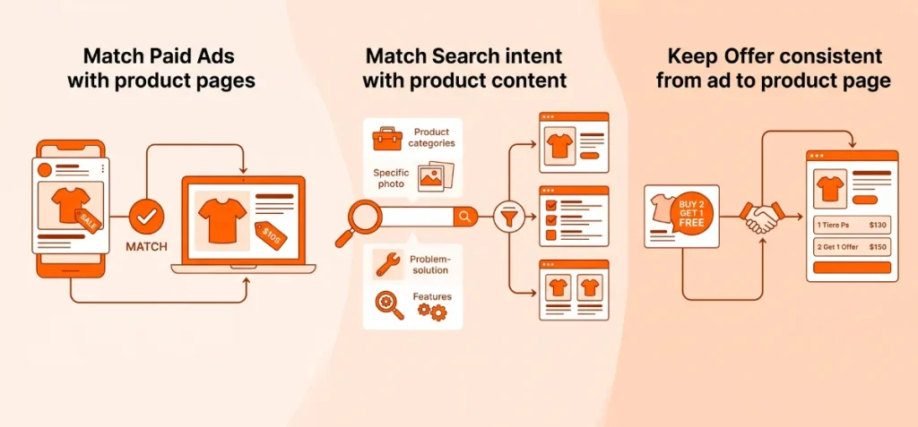
Shoppers leave when a product page fails to match what they expected to see. Every entry channel creates a specific expectation in the visitor’s mind. Align your page content with that initial prompt to keep users on the site.
Match Paid Ads With the Exact Product Page
The featured image, product color, offer, and price point shown in an ad must appear immediately above the fold.
If your ad highlights:
- A specific shirt color, load that exact color swatch by default.
- A bundle deal, show the bundled items right away.
- A percentage discount, display the updated price clearly.
- A specific use case, feature that benefit in your primary image or headline.
Match Search Intent With Product Page Content
Organic visitors arrive with varied search goals. Design your core elements to answer their explicit search query:
- Product Category Searches: Direct users to clear sub-collections or main entry products.
- Specific Product Searches: Put the exact product title, clear images, and immediate buying options front and center.
- Problem-Solution Searches: Lead with copy that explains how the item solves their specific pain point.
- Feature Searches: Highlight specs, materials, or unique mechanics high on the page.
- Comparison Searches: State key differentiators, value propositions, and specs immediately.
Keep the Offer Consistent From Ad to Product Page
Promotions like “Buy 2, Get 1 Free” or “Save 20%” fail when shoppers must hunt for the deal after landing. The exact offer must greet them on arrival.
When running quantity discounts or multi-buy campaigns, display those tiered offers directly within the purchase area.
Use a specialized app like Echo Bundle to embed volume discounts, BOGO deals, tier breaks, free gifts, and shipping incentives right into the main buying flow.
That continuity confirms the ad promise immediately and keeps shoppers from bouncing.
2. Fix the First Screen Before Optimizing the Rest of the Page
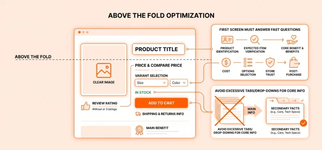
Shoppers decide to stay or leave in seconds. The top screen must answer seven fast questions:
- What is this product?
- Is this the product I expected?
- What does it do?
- How much does it cost?
- Which option should I choose?
- Can I trust this store?
- What happens after I click Add to Cart?
Build a Strong Shopify Product Page Above the Fold
Put the core details together where people see them first. Key page elements need to work as a team:
- Product title: Name the item clearly so buyers know they landed in the right place.
- Clear main product image: Show the full item with clean lighting.
- Price and compare-at price: Show the current price next to the original cost if it is on sale.
- Review rating: Place star scores right below the title to build quick trust.
- Main product benefit: Use one simple line to explain what problem the item solves.
- Variant, variant option, and variant value: Help shoppers pick choices like size, color, or material without confusion.
- Availability information: Tell buyers if the item is in stock.
- Add to Cart button: Make this primary button big and easy to see.
- Shipping information and return policy: Add quick notes below the main button about fast delivery or easy returns.
Do Not Hide Important Buying Information Behind Too Many Interactions
Tabs and drop-down menus clean up extra clutter. However, hiding core details causes big problems. Shoppers get tired when they must click five tabs just to read basic features.
Use menus only for secondary facts like care steps or deep tech specs. Keep main benefits, sizing, costs, and policies open right on the main screen.
3. Make Variant Selection Fast and Obvious
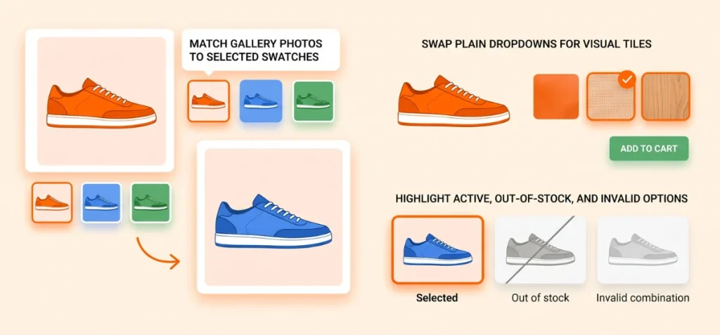
Shoppers leave product pages fast when option choices confuse them. They bounce the second picking a color, size, or material feels like hard work.
Match Gallery Photos to Selected Swatches
Text choices without visual proof create instant doubt. A buyer taps ‘Blue,’ but the main image stays red. They freeze, lose trust, and leave.
Connect each main photo set directly to its specific variant. Use Echo Swatch to auto-hide irrelevant colors. This app keeps the main gallery clean, and buyers see their exact item before checkout.
Swap Plain Dropdowns for Visual Tiles
Basic dropdown menus hide critical details. Text works well for standard shoe sizes, but visual traits need visual proof. Use visual tiles for:
- Fabric weaves and material textures
- Furniture finishes and wood tones
- Apparel colors and pattern prints
- Product graphics and custom designs
Color tiles deliver instant visual confirmation, so customers buy with confidence.
Highlight Active, Out-of-Stock, and Invalid Options
Vague buttons derail purchases. Show clear selection states to guide buyers smoothly through checkout:
- Selected choices: Border active picks with strong, bold outlines.
- Sold-out variants: Fade or cross out unavailable options to stop dead clicks.
- Invalid combos: Grey out impossible pairs, such as small sizes in wide fits.
- Missing steps: Highlight forgotten choices directly if a buyer clicks “Add to Cart” too early.
4. Use Product Images to Answer Buying Questions
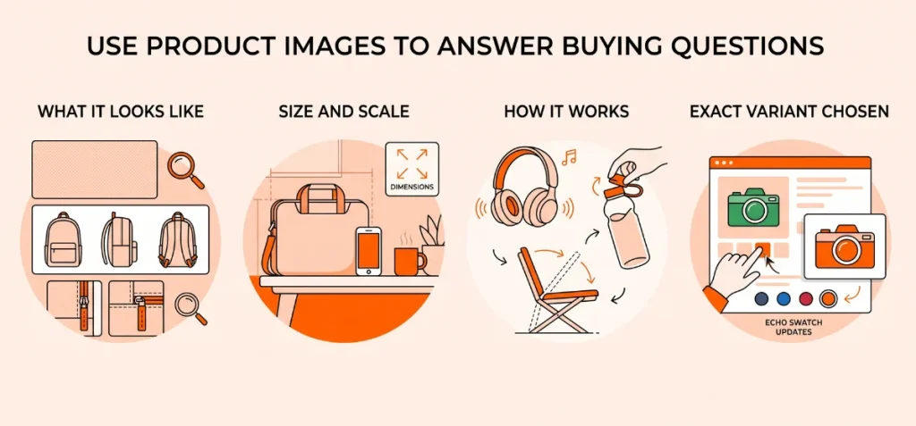
Generic high-quality photos fail to convince buyers. Frame each product image around a clear buyer question instead.
Show What the Product Looks Like
Shoppers want to inspect items closely before buying. Answer their visual doubts with targeted detail shots:
- Close-up texture and material views
- Front, side, and back angle shots
- Fine build details like stitching or hardware
Show Size and Scale
Unclear dimensions drive high return rates. Help buyers gauge real-world fit quickly:
- Clear dimension overlays on main photos
- Side-by-side shots next to common objects
- Scale context using models or real rooms
Show How the Product Works
Static images rarely explain performance or utility. Show the item in action to build value:
- Real-life lifestyle settings
- Step-by-step usage demonstrations
- Quick feature loop videos
Show the Exact Variant Chosen
Match images directly to selected options to finalize the sale. As covered in the previous section, variant choices require immediate visual proof.
Utilize Echo Swatch to update the main gallery instantly when options change. It builds buying confidence among buyers.
5. Answer Purchase Questions First
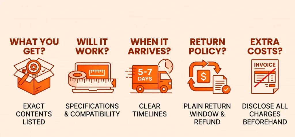
Every unanswered doubt pushes shoppers toward the exit. Anticipate friction by answering core buying questions directly on the page.
What Exactly Do I Get?
Buyers fear receiving incomplete packages. List exact item contents, quantities, box inclusions, and missing parts upfront.
Will It Work for Me?
Doubt destroys conversion rates. Clear up technical fit issues using detailed specifications:
- Exact size guides and measurements
- Hardware or software compatibility lists
- Full ingredient lists or material breakdowns
- Real-world use case examples
When Will It Arrive?
Vague delivery timelines trigger cart abandonment. Display explicit fulfillment details:
- Warehouse processing times
- Realistic delivery window estimates
- Base shipping costs and thresholds for free shipping
What Happens If I Need to Return It?
Hidden return policies scream risk. State your return window, refund terms, and exchange steps in plain language near the buy button.
Are There Any Extra Costs?
Surprise fees at checkout kill trust instantly. Disclose all potential charges beforehand, covering added shipping costs, applicable taxes, and price shifts tied to specific product variants.
6. Add Trust Signals Where Shoppers Need Them
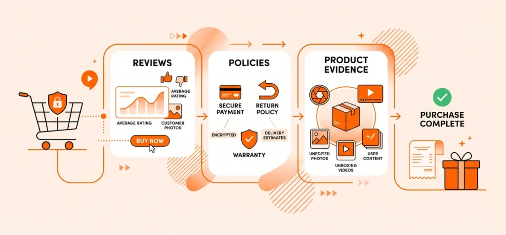
Trust badges placed randomly fail to convert. Position proof points right where purchase anxiety spikes to drive decisions.
Add Reviews Near the Purchase Decision
Place social proof directly alongside price and buy buttons. Target conversion friction with transparent customer feedback:
- Average star ratings paired with total review counts
- Filterable text reviews highlighting specific product traits
- User-submitted photos showing real-world product conditions
Use Specific Trust Information Instead of Random Badge Clutter
Generic badge spam causes visual noise and lowers credibility. Swap generic logos for practical, clear policy guarantees:
- Encrypted checkout and secure payment processing logos
- Plain-language return policies near the add-to-cart button
- Upfront delivery estimates and active warranty details
Show Real Product Evidence
Unfiltered content builds immediate buyer trust. Overcome skepticism using authentic visual proof:
- Unedited customer photos and unboxing videos
- Real user-generated content from social channels
- Direct product demonstration clips showing actual performance
7. Make the Add to Cart Decision Easy on Mobile
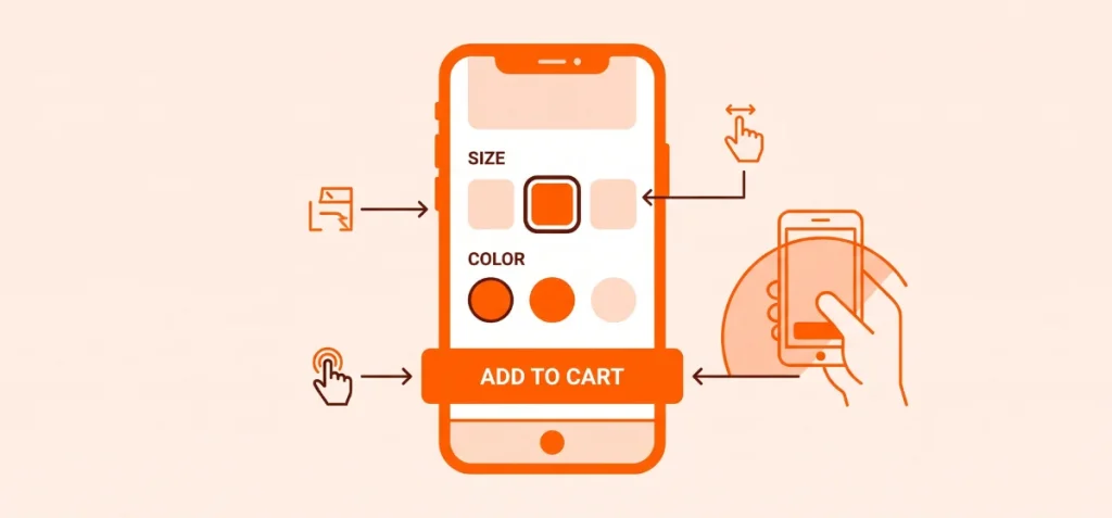
Ever try buying something on a phone, but the buttons are so small you keep tapping the wrong thing? It gets annoying fast. If a store page is hard to use, people just close it and walk away.
Put the Main Buy Button Right in Front
If shoppers can’t find the button to buy your product, they will give up. Make that main button impossible to miss:
- Pick bright colors that pop off the screen
- Make the button big enough for a quick, easy tap
- Keep the button visible right after someone picks their size or color
- Stick the button to the bottom of the screen so it stays put when scrolling
Make Buttons Big Enough for Fingers
Tiny buttons lead to misclicks, and misclicks make people mad. Design your choices so anyone can tap them easily:
- Make color and size boxes large enough for big thumbs
- Space out the buttons so options do not touch
- Put a bold border around the choice a shopper picks
- Open size guides in a quick pop-up window so nobody gets lost
Try the One-Thumb Test
Here is a cool trick to see if a phone page works. Pick up a phone with just one hand and see if you can do all of these things using only your thumb:
- Swipe through all the product pictures
- Pick a size or color without misclicking
- See the final price clearly
- Check when the item will arrive
- Tap that big button to add the item to your cart
If any step feels awkward or forces you to bring in your other hand, the page needs bigger buttons and better spacing.
8. Improve Product Page Speed Without Removing Important Buying Information
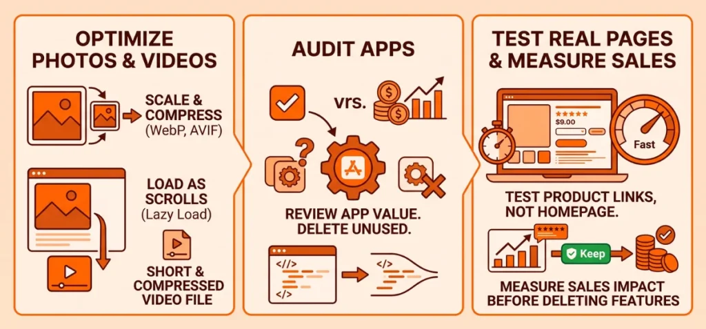
Many guides tell you to gut your product page to make it fast. That is bad advice. A blank page loads instantly, but it sells nothing.
Your goal is to strip away invisible code weight while keeping every single photo, review, and detail that helps people buy.
Optimize Your Product Photos and Videos
Huge image files drag down load times without adding value. Fix your visual media so it loads instantly on any phone:
- Scale photos down to match the exact size they show on screen
- Compress file sizes using modern formats like WebP or AVIF
- Set images below the top fold to load only as the shopper scrolls down
- Keep product videos short and compressed instead of dropping massive raw files onto the page
Audit Your Apps for Real Value
Every Shopify app you add inserts extra code behind the scenes. Review your app list like a budget: does this feature bring in enough sales to justify the tiny hit to your page speed? If an app barely gets used, delete it.
Test Your Real Product Pages, Not Just the Homepage
Homepages are simple. Product pages are heavy because they load variant scripts, review widgets, product bundles, and upsell blocks. Test your actual product links on speed checkers, not just your main site address.
Measure Sales Impact Before Deleting Features
Do not go on a deleting spree just to get a high score on a speed test. A review widget or a size chart app might slow your load time by half a second, but it might also be the main reason shoppers trust your store.
Always test if removing a helpful tool drops your sales before you leave it turned off for good.
9. Give Shoppers a Clear Reason to Buy More
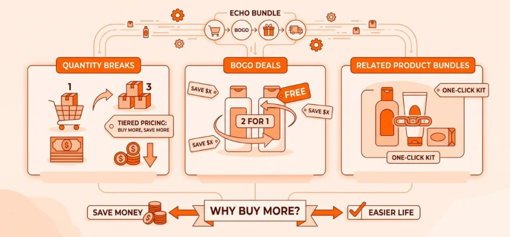
Extra paragraphs of text will not save a sale if a customer hesitates. Sometimes they want a bigger pack, a better price, or a complete setup. Hence, offer options that make buying more feel like a smart move.
Show Quantity Breaks for Bigger Savings
Clear discounts reward bulk orders. Offer tiered pricing to raise total cart values:
- Buy 2 and save $5
- Buy 3 and save $12
- Multi-packs for daily-use goods
Use BOGO Deals That Match Your Margins
Buy One, Get One deals work best on items people replace often. Keep the offer math simple so customers spot the value right away.
Bundle Related Products Together
Group complementary items into one-click kits:
- Shampoo paired with conditioner
- Cameras packed with memory cards
- Skincare steps sold as a routine
- Main items bundled with refills
Use Echo Bundle easily set up bundles. You can display quantity breaks, BOGO offers, free gifts, and shipping rewards directly on the product page.
Make sure these offers make sense. Do not clutter the page just to push a higher bill.
Every bundle must answer one simple question for the buyer: “Why does this combination make my life easier or save me money?”
10. Give Shoppers a Relevant Alternative
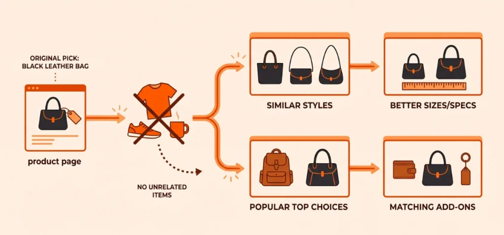
Shoppers leave when an item misses the mark. Do not let that turn into an exit. Show alternative picks that match their original goal:
- Similar styles or shapes
- Better-fitting sizes or specs
- Popular top choices in that same category
- Matching add-ons that fit the main item
Keep recommendations tight and focused. If someone looks at a black leather bag, show other leather bags.
Do not show unrelated t-shirts or shoes to break their focus. Give them a clear second path to find what they want.
11. Remove Popups and Other Interruptions That Appear Too Early
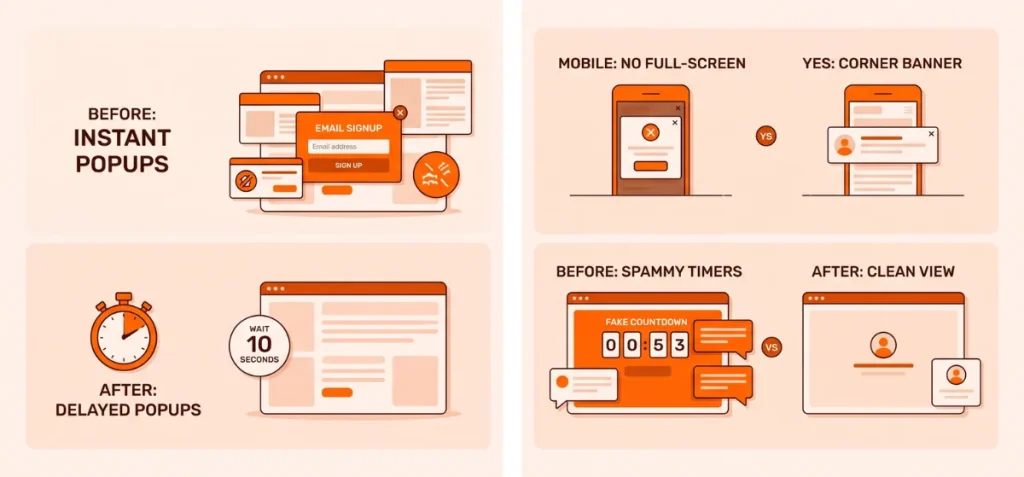
Shoppers leave fast when annoying popups block their view. Let buyers see the product first before you throw popups at them.
- Delay immediate email popups. Give visitors a few seconds to look around before asking for an email address.
- Stop full-screen mobile popups. Huge boxes hide the whole screen on phones and frustrate buyers.
- Hide extra chat widgets. Too many chat boxes and widgets cover up the main photos and text.
- Skip fake countdown timers. Fake timer bars look spammy and ruin trust before people even read about the product.
- Use exit intent popups carefully. Trigger popups only when a buyer moves their mouse to leave the page.
Urgency tools work fine after a shopper likes an item. Early interruptions just drive people away.
Make every popup easy to close with a clear cross icon. Never let popups cover up product options or the main buy button on mobile screens.
12. Fix Traffic Quality Problems Before Changing the Page
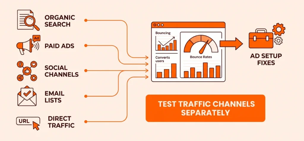
Sometimes product pages do not sell because the traffic is wrong. Shoppers leave fast if an ad promises one thing and the page shows another.
Test your traffic channels separately before you change a single design element:
- Organic search: Buyers search for exact items and usually stay longer.
- Paid search: Visitors click ads for specific needs and expect instant answers.
- Paid social: Social media scrollers click on cool visuals, but they bounce easily.
- Email lists: Existing fans open emails, trust your brand, and buy faster.
- Direct traffic: Loyal customers type your link directly into their browser.
Compare bounce rates across all these traffic channels. Imagine your organic and email traffic converts well, but one paid ad campaign loses every visitor. Look at your ad setup instead of redesigning the whole page:
- Check audience targeting rules
- Match ad text to page details
- Fix broken promo offers
- Send ad clicks to the right product link
Fix bad ad traffic and do not tear down a good product page just because one ad campaign sends the wrong crowd.
How to Find the Exact Reason Visitors Bounce From a Shopify Product Page
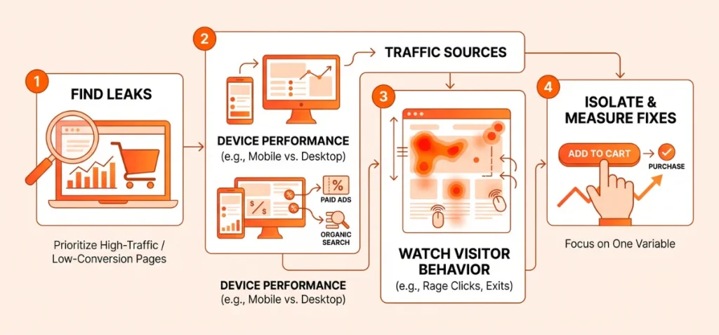
Prioritize pages where improvements affect meaningful traffic. High-traffic, low-conversion pages offer the biggest leverage.
Check Google Analytics to pull your top 20% most-visited product links. Sort them by bounce rate or low time on page to find your worst leaks.
Compare Performance by Device:
Check if mobile metrics lag behind desktop.
- Is mobile significantly worse? Check tap targets, slow media loads, or hidden buttons below the fold.
- Is desktop performing normally? Desktop users might see clear layouts, while mobile users suffer from messy popups.
Investigate mobile UX and site speed first if you spot a gap.
Compare Performance by Traffic Source:
Track how different channels behave on the page.
- Does paid social bounce more? The ad promise might not match the product details.
- Does organic traffic engage? Search visitors usually look for deep specs or size guides.
- Does email perform better? Warm audiences usually show high intent and lower bounce rates.
Watch What Visitors Do Before Leaving:
Use heatmaps, session recordings, and scroll depth tools to spot precise friction.
- Rage clicks: Fast, repeated taps signal broken buttons or slow script response.
- Variant confusion: Buyers click unavailable color swatches and drop off.
- Early exits: Users leave right before seeing shipping details, hiding costs until too late.
- Zero interactions: Visitors scroll past “Add to Cart” directly to reviews, seeking trust signals first.
Fix One Clear Friction Point and Measure Again:
Never change five elements at once. Isolate one single variable, such as moving your shipping notice above the fold or resizing your main CTA.
Track three metrics before and after the update:
| Metric | Goal |
| Engagement Rate | Measures initial visual hook |
| Add-to-Cart Rate | Measures purchase intent |
| Conversion Rate | Measures final revenue impact |
Shopify Product Page Bounce Rate Checklist
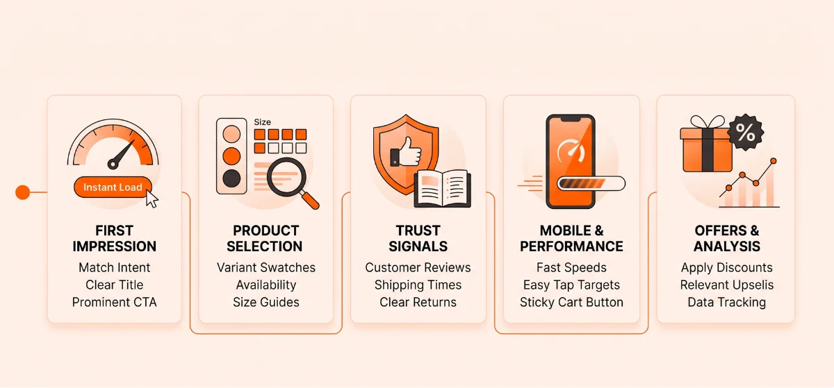
Audit your Shopify product pages against this checklist to quickly spot UX friction, boost intent, and convert lost visitors into buyers.
First Impression
- Ad/Search Match: Heading and imagery immediately reflect the ad or search intent.
- Product Name: Visible above the fold without scrolling.
- Image Load Speed: Primary image renders instantly on load.
- Price Visibility: Clear price displayed next to the main title.
- CTA Prominence: “Add to Cart” button uses a high-contrast color.
- Key Benefit: Hero section features a short, value-driven subheadline.
Product Selection
- Variant Clarity: Swatches and dropdowns clearly separate colors, sizes, or materials.
- Visual Selection: Selected variant updates the main gallery image immediately.
- Out-of-Stock Status: Unavailable options display greyed out or marked clearly.
- Sizing & Specs: Size charts or compatibility guides open near the variant selector.
Trust Signals
- Social Proof: Star ratings and review counts sit right below the product title.
- Shipping Terms: Delivery estimates and rates appear near the checkout button.
- Return Policy: Clear return window and guarantee details rest near buying buttons.
- Visual Confidence: Gallery includes zoom, high-res angles, or real customer photos.
Mobile & Performance
- Fast Load Times: Page interactive elements load in under two seconds on 4G networks.
- Tap Targets: Buttons, swatches, and links maintain a minimum height of 48px.
- Sticky CTA: “Add to Cart” button stays visible at the bottom of the mobile screen.
- Popup Management: Promos and email signups never block main buy buttons or price.
- App Audit: Unused third-party scripts and code are regularly deleted.
Offers & Next Steps
- Discount Continuity: Promo codes from ads automatically apply or display clearly.
- Simple Bundles: Volume pricing or cross-sells show simple math with no hidden steps.
- Relevant Recommendations: Upsells display complementary items, not random products.
- Clear Next Step: Primary action remains focused on checkout with zero competing CTAs.
Measurement & Analytics
- Device Segmentation: Conversion data breaks down across desktop, mobile, and tablet.
- Source Segmentation: Paid, organic, and email traffic show individual bounce rates.
- Page Prioritization: Optimization starts with top 20% highest-traffic product links.
- Behavioral Audits: Session recordings and heatmaps highlight friction weekly.
- Metric Pairings: Add-to-cart rate gets tracked alongside total bounce rate to spot leaks.
What Is a Good Bounce Rate for a Shopify Product Page?
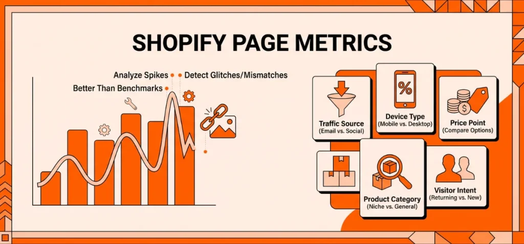
No single percentage defines a healthy bounce rate. Industry averages range from 35% to 50%, but judging your store by a static metric hides the real picture. Context dictates behavior.
What Shapes Your Real Benchmark?
- Traffic Source: High-intent search visitors and email subscribers yield low bounce rates. Paid social traffic bounces far more often because ads interrupt passive scrolling.
- Device Type: Mobile shoppers bounce faster than desktop users. Screen space restrictions and cellular speeds create instant friction.
- Price Point: High-ticket items require research. Visitors leave to compare options, raising bounce rates naturally without signaling a weak page.
- Product Category: Niche, solution-focused items pull low bounce rates. General apparel triggers heavy virtual window-shopping and higher bounce rates.
- Visitor Intent: First-time visitors explore and leave. Returning customers land directly on the page to buy, driving low bounce rates.
Why Historical Trends Beat Benchmarks
A sudden spike in your page’s own historical bounce rate signals real trouble faster than any external industry average.
Track your baseline metric regularly. Sudden changes expose broken code, missing images, or mismatched ads right away. Monitoring internal trendlines protects sales far better than chasing generic benchmarks.
Reduce Friction Before You Try to Reduce the Number
High bounce rates signal friction. Visitors leave when your page blocks their path to checkout.
Learn how to reduce bounce rate on Shopify product pages with a clear workflow: find where shoppers drop off, fix the exact block, and track conversion impact.
Do not focus on page time alone. Qualified buyers need confidence to take the next step. Clear the path, remove friction, and sales follow.
FAQs
Does Page Speed Affect Shopify Bounce Rate?
Yes. Slow pages frustrate shoppers, causing them to leave before key images, titles, or prices even load on screen.
Do Product Bundles Reduce Bounce Rate?
They help when offers match buyer intent. However, bundles won’t save a page with poor imagery, bad copy, or slow speed.
What is the Difference Between Bounce Rate and Exit Rate?
Bounce rate tracks single-page sessions. Exit rate tracks the percentage of visitors who leave your site from a specific page after browsing.
Is a 42% Bounce Rate Good for Shopify?
Potentially. Success depends on your traffic channels, device breakdown, price range, and how the number compares to your historical baseline.
Is a 30% Bounce Rate Bad?
Generally no. A 30% rate is strong, but always evaluate it alongside add-to-cart rates to ensure visitors actually buy.