
How to Change Swatch Product Image Size in Shopify – Two Methods

The easiest way to change Shopify swatch size is to check your theme’s Variant Picker settings first. If your theme doesn’t provide a size control, change the swatch dimensions with CSS.
Small, blurry, or misaligned swatch buttons frustrate shoppers. Again, store owners often struggle when learning how to change size of swatch product images in Shopify because display options vary wildly across themes.
But it isn’t that hard! Modern themes handle image swatches quite differently than older setups, often putting controls in unexpected menus.
This guide walks through native theme editor settings, custom CSS tweaks, and image resolution rules. You will learn how to change product image swatch size and make it look good on varied screens.
What is a Swatch Product Image in Shopify?
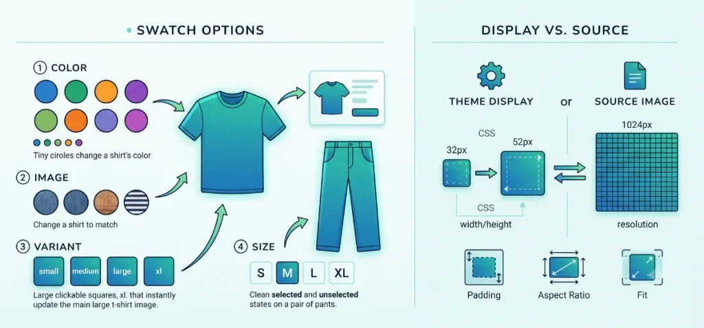
Swatches replace standard, plain drop-down menus with interactive visual buttons on product pages. They allow buyers to preview color choices, fabric textures, or size options with a single click.
- Color swatch: Shows a solid color block or hex code for specific choices like Black, Navy, or Red.
- Image swatch: Features a tiny, real-world photo of actual patterns, materials, or graphic details.
- Variant image: Connects straight to the main photo assigned to a specific variant product.
- Size swatch: Formats text choices into neat, clickable pills or blocks.
- Variant picker: The primary theme section that contains all available product option inputs.
Take a classic t-shirt as a simple example.
A basic color option lists choices as plain text: Black, Blue, or Red.
An image swatch replaces that plain text with tiny and actual fabric snapshots.
Shopify handles variant options natively. Compatible themes convert color entries into visual swatches right.
Swatch Size vs. Product Image Size
CSS swatch size changes how large a button looks on screen. It never alters your uploaded source file dimensions.
| Property | What It Controls | Impact on Storefront |
| Swatch CSS width/height | Physical display area | Shifts the button size on your page layout |
| Source image dimensions | File pixel resolution | Sets the underlying photo quality |
| Background-size | How the image fits the container | Controls crop, zoom, or stretch behavior |
| Aspect ratio | Height-to-width proportions | Creates square, circle, or rectangle shapes |
| Padding/gap | Empty space around edges | Prevents crowded options on small screens |
Expanding a swatch button from 32px to 52px does not mean you must re-upload a tiny 52×52px picture file.
Display dimensions in your theme stylesheet stay completely separate from source file pixel resolution.
How to Change Swatch Size in Shopify
Keep reading the article to learn in-depth about all methods.
Method 1 — Change Swatch Size From the Shopify Theme Editor
This section contains the built-in theme settings that offer the simplest way to adjust swatch dimensions without editing code.
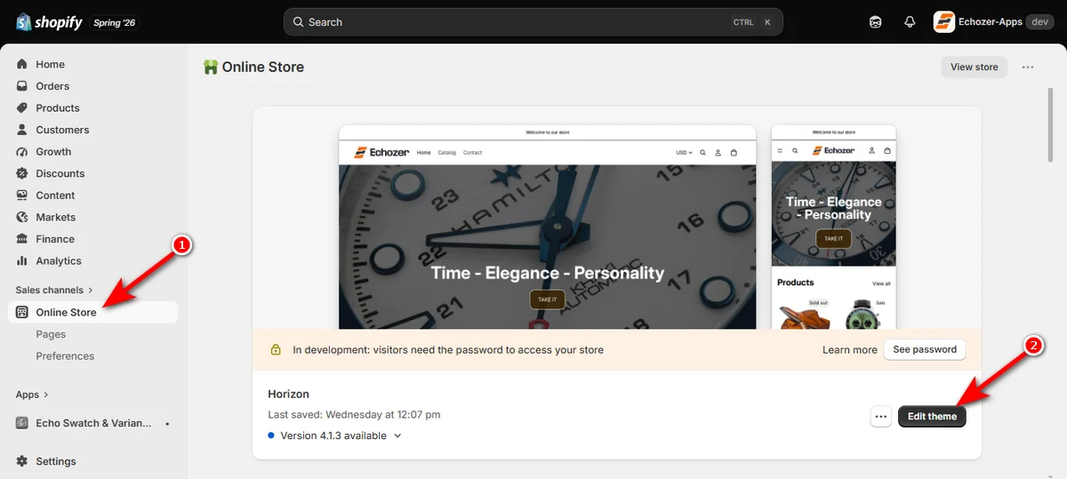
Step 1: Open Shopify Admin and Click Edit Theme
Log into your store dashboard and click “Online Store” on the left menu. Find your active theme card and click the “Edit theme” button.
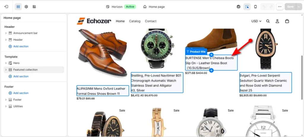
Step 2: Select a Product Page
Use the top page dropdown menu inside the editor to open a product page. Click any product with variant options to view its current swatches.
Step 3: Open Theme Settings and Click Swatches
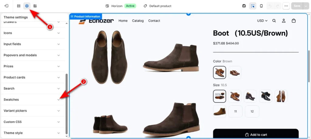
Click the gear icon (Theme settings) on the left toolbar. Scroll down the menu list and select ‘Swatches’ to open display controls.
Step 4: Adjust Swatch Width and Height
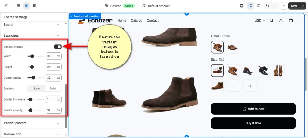
Toggle the “Variant images” switch to the ‘On’ position. Drag the ‘Width’ and ‘Height’ sliders to set your desired pixel dimensions, or adjust the “Corner radius” for rounded edges.
Step 5: Adjust Variant Picker Sizing
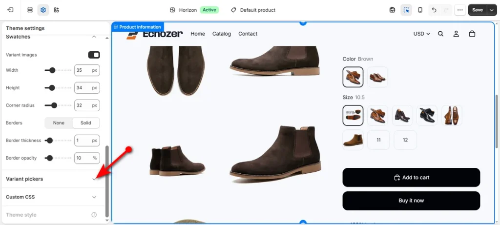
Scroll down the left panel and click “Variant pickers.”
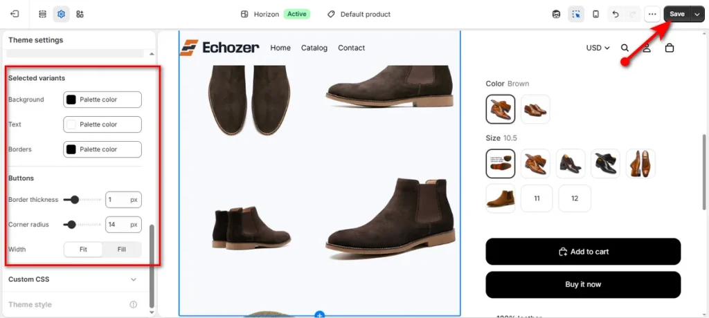
Fine-tune option button borders, corner radius, and layout width settings under this dropdown. Lastly, click the ‘Save’ button in the upper right corner to publish your updates.
Important Theme Nuance: Not every Shopify theme provides direct numerical sliders for swatch width and height. Compatible themes often restrict customization to basic style shapes like Circle or Square within the Variant picker block.
While theme settings control physical box dimensions, managing complex variant images remains a challenge. To address that, you can use Echo Swatch. It automatically assigns variant photos using AI, keeping main product galleries clean regardless of swatch size.
Method 2 — Change Swatch Image Size With CSS
If your theme doesn’t come with built-in size editing settings, you need to insert custom CSS rules to override theme defaults and set exact swatch dimensions.
Before You Edit Theme Code
Make a backup copy of your theme before you alter stylesheet files.
- Navigate to “Online Store” on your left menu.
- Click the “three dots” next to your active theme.
- Select ‘Duplicate’ to create a backup file.
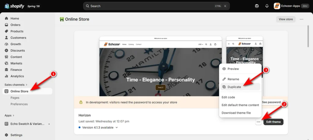
- Once you create a backup file, click the “Edit theme” button on your active theme to open the customizer preview.
Find Your Swatch CSS Selector
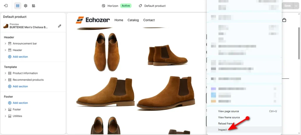
Open a product page inside your store editor. Right-click on the white area (without selecting anything on the customizer) and select ‘Inspect’ to open the dev browser window.
Click the ‘Elements’ inspect tool icon, then select a swatch image. Check the ‘Styles’ panel on the right side to view the target CSS attributes.
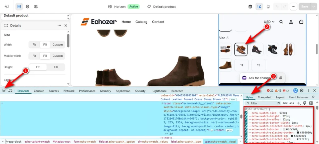
CSS class names and attributes vary depending on your theme codebase. Dawn, Horizon, or custom third-party themes use different target class names and variables.
Example CSS for Image Swatches
Replace selector names with the exact class name from your browser inspect panel.
.swatch {
  width: 52px !important;
  height: 52px !important;
  min-width: 52px !important;
  border-radius: 6px !important;
}

.swatch--variant-image {
  background-size: cover !important;
  background-position: center !important;
}- width & height: Controls physical box dimensions.
- min-width: Stops swatch buttons from shrinking inside small columns.
- border-radius: Sets corner curvature.
- background-size: cover: Scales uploaded images without distortion.
- background-position: center: Keeps main design details centered inside the button frame.
How to Shape Swatch Buttons
Adjust your border-radius value to change button shapes:
- Square swatches: Set border-radius: 0px !important;
- Rounded swatches: Set border-radius: 8px !important;
- Circular swatches: Set border-radius: 50% !important;
How to Add Space Between Swatches
Set a gap distance on the parent button container:
.variant-option--buttons {
  gap: 12px !important;
}
How to Target Mobile Screens Only
Wrap rules inside a responsive media query to apply edits exclusively to mobile devices:
@media screen and (max-width: 749px) {
  .swatch {
    width: 44px !important;
    height: 44px !important;
  }
}
Developer Disclaimer
Do not attempt this method if you lack developer experience. Incorrect code edits break your store layout, disable add-to-cart buttons, or ruin checkout flows. Partner with a developer if code modification feels unfamiliar.
Where to Insert Your CSS Code
Paste your custom CSS into the built-in customizer field to apply changes safely:
- Go to your Shopify admin dashboard and select “Online Store” and click the “Edit theme” button.
- Open the theme settings menu using the gear icon on the left sidebar.
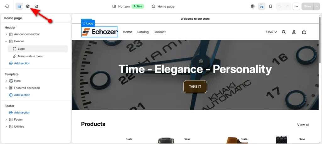
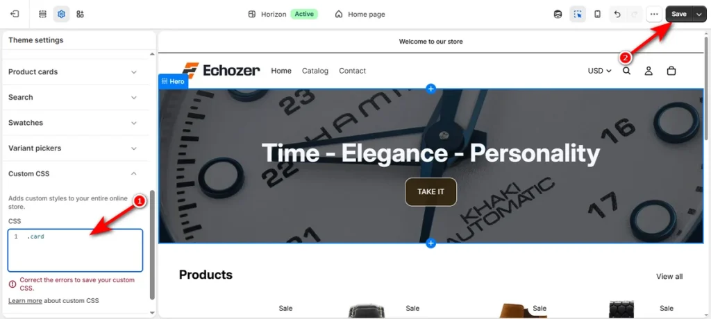
- Scroll down the settings panel and click “Custom CSS.”
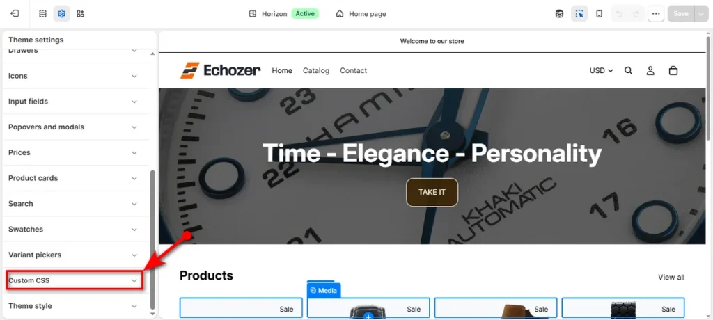
- Paste your CSS snippet directly into the box and click ‘Save.’
What Size Should Shopify Swatch Images Be?
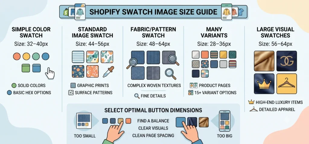
Recommended starting points vary based on display requirements, product category, and screen space.
| Swatch Type | Recommended Display Size | Practical Use Case |
| Simple color swatch | 32–40px | Solid colors and basic Hex options |
| Standard image swatch | 44–56px | Simple graphic prints and surface patterns |
| Fabric/pattern swatch | 48–64px | Complex woven textures and fine details |
| Many variants | 28–36px | Product pages featuring 15+ variant options |
| Large visual swatches | 56–64px | High-end luxury items and detailed apparel |
Select button dimensions that suit your product details. Small 32px boxes obscure intricate fabric weaves, while oversized 64px blocks clutter mobile layouts. Strike a balance between clear visuals and clean page spacing.
How Large Should the Uploaded Swatch Image Be?
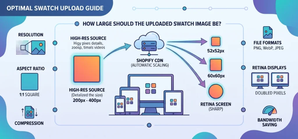
Rendered display size differs entirely from source image resolution. Display size sets physical button dimensions on your storefront, while source resolution sets underlying image detail.
A swatch displayed at 52×52px on screen easily uses a 200×200px or 400×400px uploaded file. Never crop your original source file down to a tiny 52×52px thumbnail before upload.
Shopify handles image scaling dynamically through its content delivery network (CDN). Upload high-resolution square files, and let the store system serve optimized assets across different screens.
- Resolution: Upload files sized between 200×200px and 400×400px to maintain crisp visual detail.
- Aspect ratio: Keep a strict 1:1 square ratio for every uploaded swatch image to avoid stretched shapes.
- Compression: Compress files before upload to save bandwidth without sacrificing sharp visual lines.
- File format: Choose PNG for graphics with transparent backgrounds, or WebP/JPEG for detailed fabric photos.
- Retina displays: High-density mobile screens require double pixel counts to render small details sharp instead of blurry.
- Shopify CDN: Shopify automatically generates multiple compressed image versions and serves exact sizes based on visitor device demands.
Why Your Shopify Swatch Size Isn’t Changing
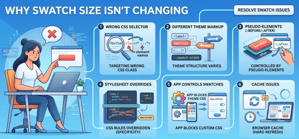
Custom code edits do not always work on the first try.
- Targeting the wrong CSS selector: Stylesheet rules fail when selector names do not match your active theme code. Right-click your swatch button on the live product page and select Inspect.
Look at the highlighted HTML tag to verify the exact class name before you paste code into your stylesheet. - Theme uses different swatch markup: Themes structure option buttons in different ways. Some rely on plain label tags, while others use button elements or custom CSS variables like “–swatch-width.”
A snippet built for another theme rarely works without small edits. - Image is controlled by a pseudo-element: Theme files often attach background images to ::before or ::after pseudo-elements.
Changes to the main parent element leave the inner visual image at its original size. Target the pseudo-element directly in your CSS to scale the visual layer. - Width and height are overridden: Existing theme stylesheets often carry higher specificity than new custom rules.
Add the !important tag directly after your pixel values to force your new dimensions. - An app controls the swatches: Installed option apps inject dynamic scripts into your product templates. App code overrides native theme settings and blocks custom CSS edits.
Adjust display dimensions inside the app dashboard instead of your theme stylesheet. - Changing the source image instead of display size: A smaller image file does not shrink the physical button frame on your screen.
The theme CSS container stays the same size, while your image loses crisp detail. Edit your stylesheet width properties to alter button dimensions. Then let Echo Swatch link those resized buttons to exact variant photos on autopilot. - Browser cache issues: Browsers save older site files to speed up page loads. Perform a hard refresh on your product page to view recent stylesheet updates.
Test your store inside a private incognito window to confirm layout changes.
Best Practices for Shopify Swatch Images
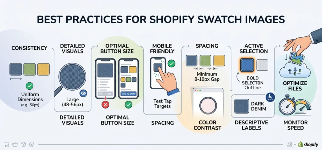
Follow this practical checklist to keep product pages clean and easy to browse:
- Maintain uniform dimensions: Keep swatch box sizes consistent across all product options on your store.
- Select larger sizes for detailed visuals: Use 48px to 56px displays when products feature fine textures, fabric weaves, or intricate patterns.
- Avoid oversized buttons: Do not make every option huge. Massive swatches push your add-to-cart button below the screen fold.
- Test tap targets on mobile: Check option buttons on real phone screens to verify shoppers can select options easily.
- Leave enough gap space: Keep at least 8px to 10px between clickable choices to prevent accidental taps on touchscreens.
- Make active selections obvious: Highlight chosen options with bold outer borders, dark rings, or distinct shadow outlines.
- Keep high color contrast: Ensure light-colored swatches stay visible against white site backgrounds.
- Include text labels: Add descriptive text names alongside visual buttons so sight-impaired users and screen readers identify options accurately.
- Compress source files: Optimize file sizes before upload to protect site performance.
- Monitor store loading speeds: Run a speed test after adding multiple image swatches to your product collections.
- Automate variant setups: Size edits solve only half the problem. Pair clean CSS dimensions with Echo Swatch. This app auto-assigns variant photos. It also hides irrelevant product pictures when buyers click different options.
Summing Up
Well, you read two methods in this content, “How to change size of swatch product images in Shopify.” One method is super simple to follow, while the other needs you to be techy.
We recommend you adhere to the first method, as it’s beginner-friendly and safe. Try the 2nd method if your theme lacks direct size controls.
Always duplicate your theme before you touch any code, inspect your swatch elements carefully, and test every change across desktop and mobile screens before you hit save.
FAQs
How Do I Change the Size of Product Swatches in Shopify?
Navigate to Online Store → Themes and click “Edit theme” on your active theme. Open a product template, select the “Variant picker” block or Theme settings → Swatches, and adjust available size sliders.
If your theme lacks built-in size controls, add target CSS rules into the Custom CSS field inside your theme editor.
What Size Should Shopify Swatch Images Be?
Upload Shopify swatch images as clean squares sized around 100×100px to 200×200px. They typically display on-screen at a small size between 32px and 50px wide. Uploading slightly larger, crisp files ensures your swatches remain sharp on high-definition retina displays.
Does Shopify Automatically Resize Swatch Images?
Yes, Shopify’s content delivery network (CDN) automatically resizes uploaded source files into compressed, web-friendly dimensions based on user device demands.
What is the Best Size for Image Swatches on Mobile?
The best rendered size for mobile image swatches is 32×32 px to 44×44 px, matching standard touch target guidelines. Upload source files at 64×64 px to 88×88 px for 2x retina resolution. This keeps your swatches sharp on mobile screens without slowing page load speeds.